[Case Study 03]
Rakuten Super DB
Big Data Ecosystem
Rakuten Super DB : An Integrated Big Data Ecosystem for Compliance & Discovery
My Impact
As the founding UX designer for SuperDB, I led the 0→1 product definition, unifying fragmented Excel workflows into a scalable data-catalog experience. By simplifying a 7-layer data hierarchy and introducing vertical classification, I significantly reduced cognitive load and enabled 100% compliance in a mission-critical system.
[Industry]
Big Data
E-Commerce
[My Role]
Lead Designer
[Platforms]
Web
[Timeline]
2018-2019
[01. Context]
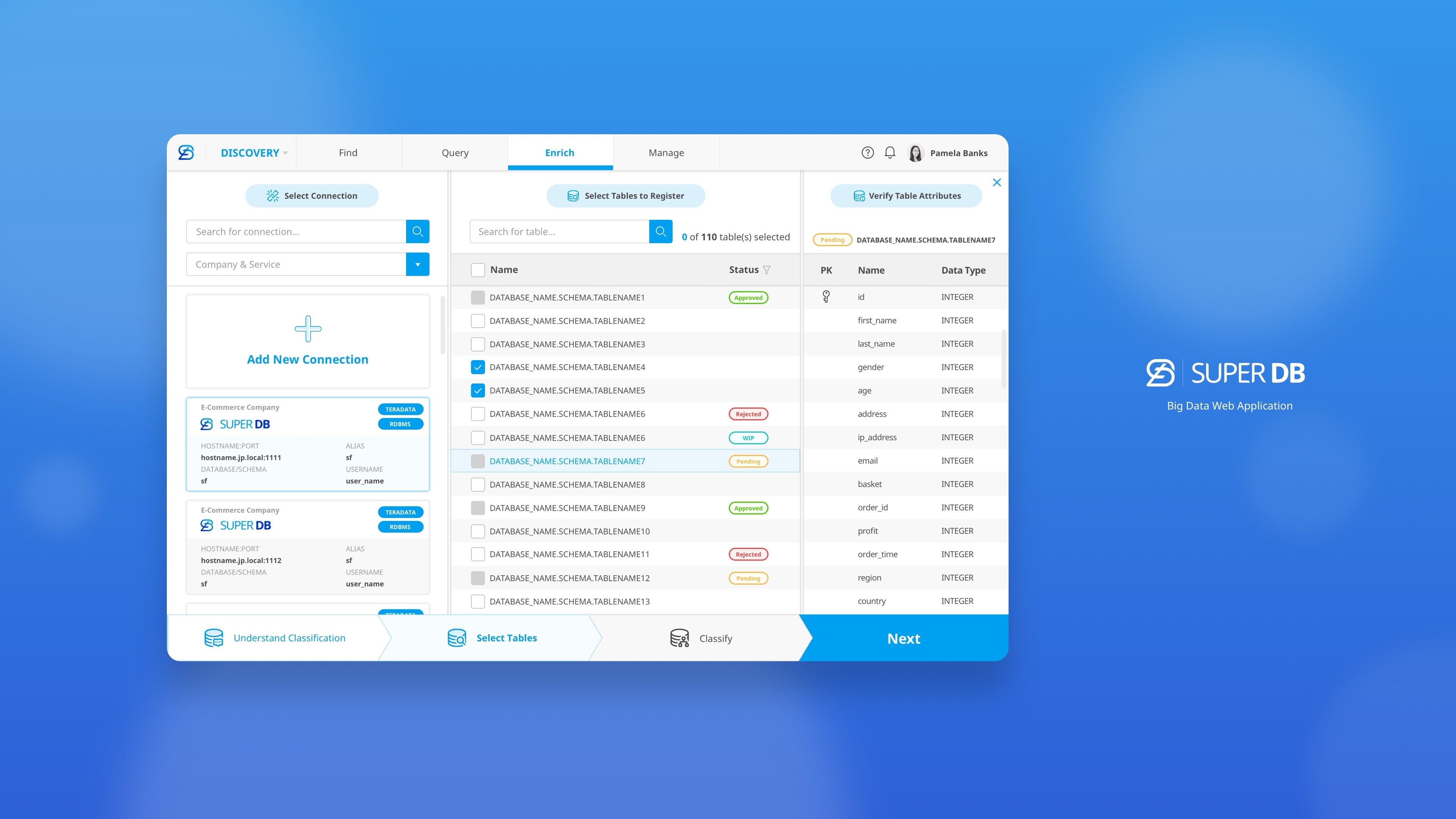
SuperDB is an enterprise data platform that enables business analysts and data scientists to ingest, transform, and consume data assets across 70+ Rakuten services in compliance with information security and regulatory requirements.
I partnered with product owners to ideate the UX, iterating through prototyping and usability testing to replace an error-prone Excel workflow with a structured, intuitive web experience.

[02. UX Challenge— Classify Data Sets]
[User Goal]
Enable business analysts and data scientists to efficiently update metadata and classify data sets to meet regulatory and information security requirements.
[Existing Flow & Core Problem]
In the existing workflow, users are required to manually classify a large number of table columns in Excel.
This process is time-consuming, error-prone, and difficult to review—especially when dealing with dozens of tables and hundreds of columns on a daily basis.
UX Challenge
Designing an interface that allows users to accurately and efficiently classify large volumes of data, while reducing cognitive load and minimizing human error.
Design Focus
Enabling intuitive, UI-driven data classification
Supporting bulk upload of Excel files with in-app review and submission
Providing a clear, structured flow from classification to approval
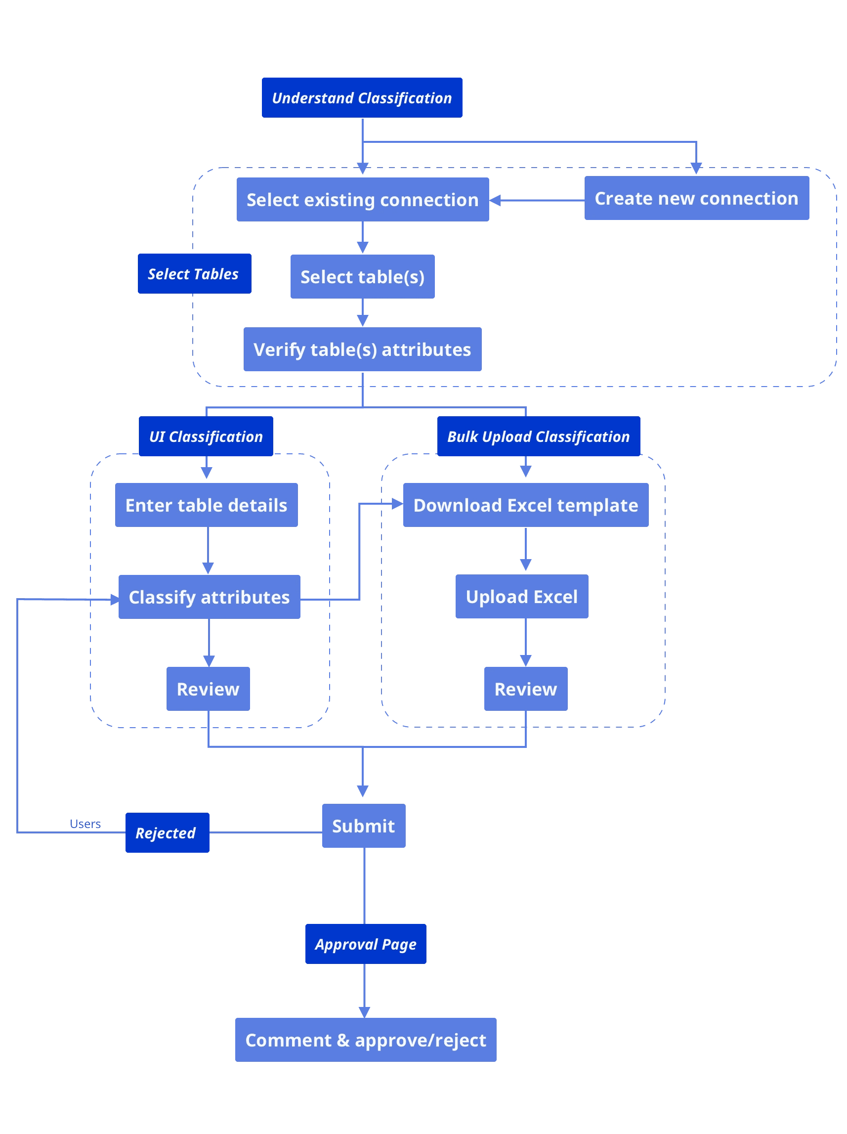
Flow Chart of Classification

Low-fi Prototype
Adopting an Excel-like layout leveraged users’ existing mental models, minimizing the learning curve.
Quick one-click switching between tables enabled efficient navigation across datasets.
[What didn’t work]
As the number of columns increased, excessive horizontal scrolling significantly increased cognitive load.
Users frequently lost orientation within the dataset, making it hard to maintain awareness of which columns were being edited.
Constrained column width limited the ability to preview sample data, reducing confidence in classification decisions.

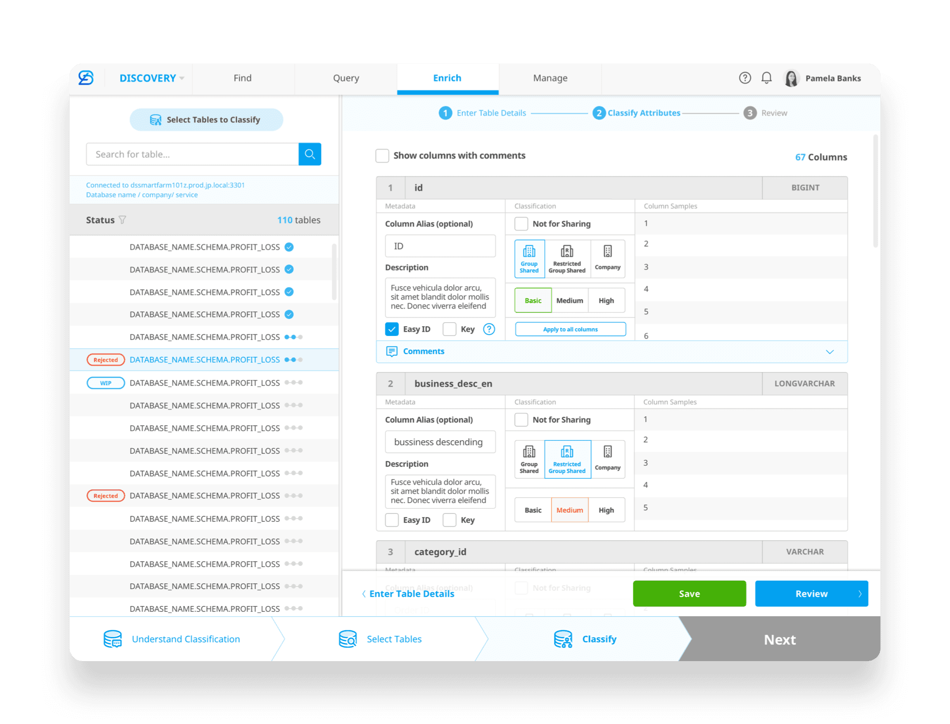
Prototype iteration
The three-step wizard helped break down a complex task into manageable steps, creating a clearer sense of progress.
Introducing a carousel-style component made column-by-column navigation more focused and reduced visual clutter.
Icon-and-text combinations made options easier to scan and interpret, supporting quicker decisions.
[What didn’t work]
The carousel interaction introduced extra clicks when moving between columns, creating friction for power users working at scale.
Previewing sample data required vertical scrolling, forcing users to shift focus away from the current classification task.
Constrained column width limited the ability to preview sample data, reducing confidence in classification decisions.

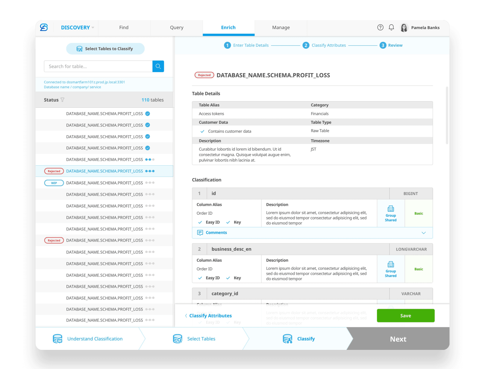
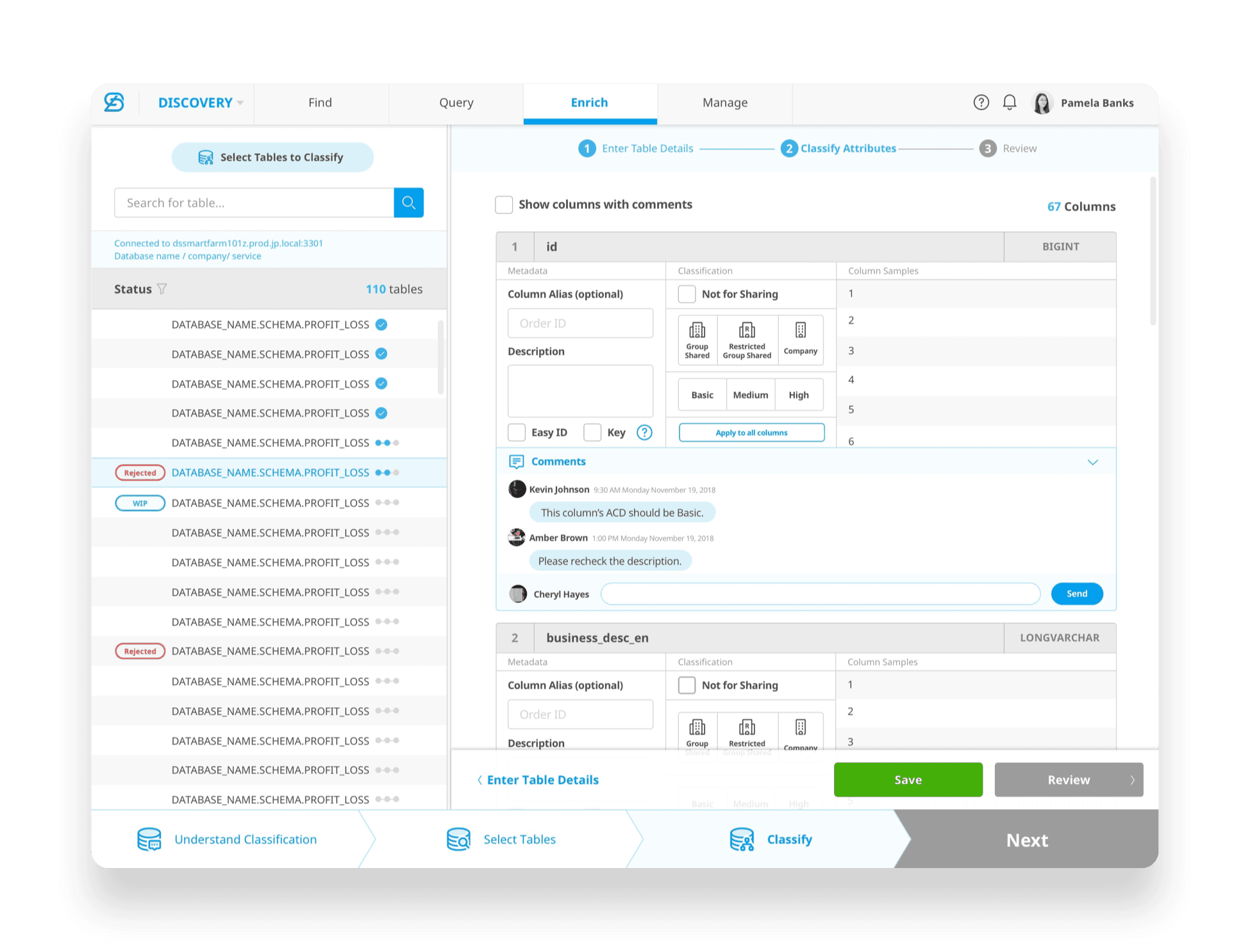
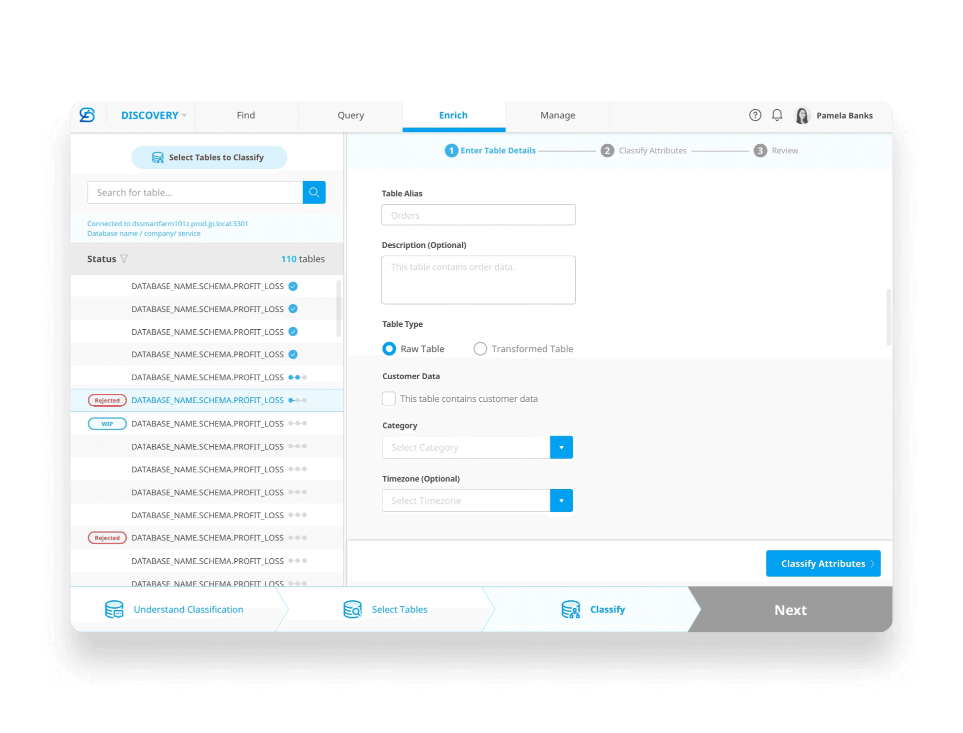
Improved Prototype - Final Handover
The layout was restructured into a vertical flow, aligning better with users’ natural scanning and editing behaviors.
Although the final design intentionally moved away from Excel’s UI patterns, the interaction logic remained clear and predictable.
The new layout received positive feedback in usability testing and improved overall task efficiency.

Comments feature was added later on based on user's feedback, it allows easy collaboration across team.
[Handover for Data Classification]

[03. UX Challenge— Data Discovery]
[User Goal]
Enable users to quickly discover relevant data assets and confidently request access by:
Searching data assets with keywords
Browsing assets across services, databases, and teams
Understanding metadata and security-related information at table and column levels
Requesting access with minimal friction
[Core Problem]
Enterprise data is organized across 7 levels of hierarchy, making it difficult for users to:
Navigate and browse data efficiently
Understand table and column details before requesting access
Decide which specific columns they actually need
As a result, searching for data becomes a high-effort, high-uncertainty task.
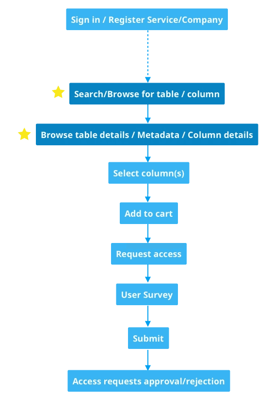
Flow Chart of Searching Data
UX Challenge
Help users move from exploration to decision-making without requiring deep system knowledge or training.
Design Focus
To reduce learning cost, I introduced an ecommerce-inspired interaction model.
Users can:
Search and browse data assets as if browsing products
Add relevant tables or columns to a “Data Cart” Request access through a familiar, checkout-like flow
By mapping a complex enterprise process to a well-known mental model, the experience turns an unfamiliar task into an intuitive, learnable workflow.

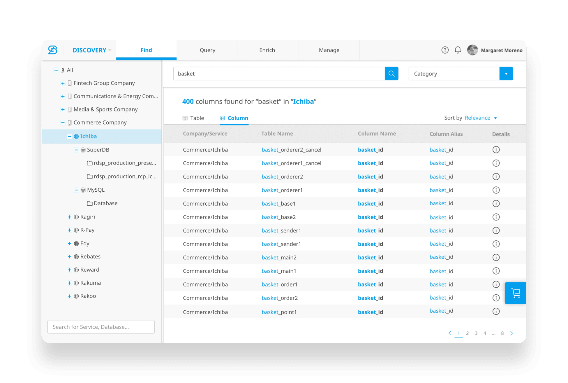
Search for date across companies & services

Select columns to request data
Prototyping
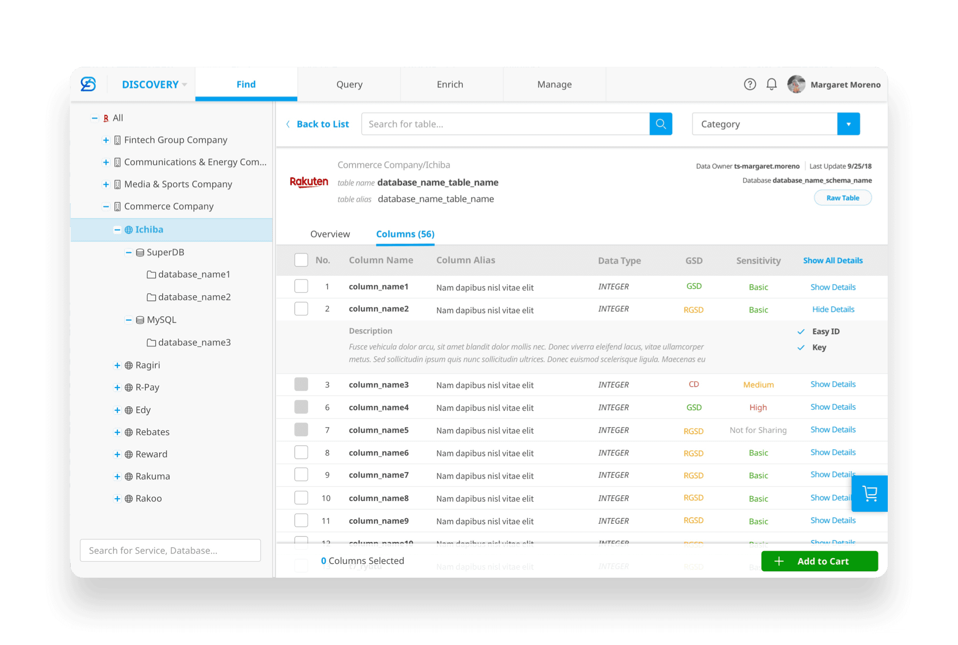
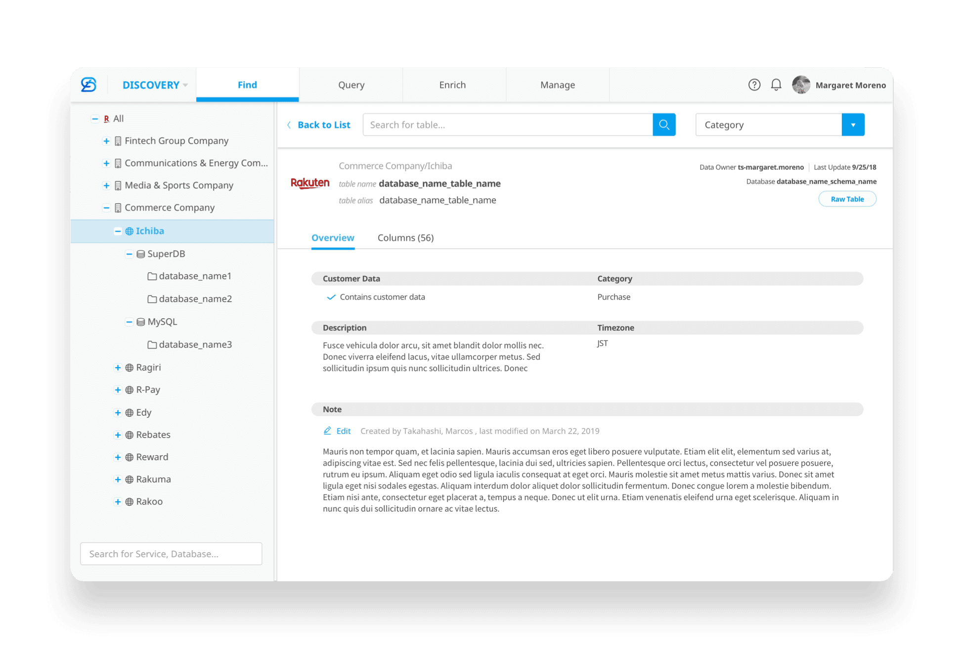
Clear master–detail structure: selecting a table or column on the left reveals detailed information on the right
Consistent column layout aligned with the classification experience, improving learnability and reuse
[What didn’t work]
Too many levels in the company & service filter dropdown make it hard to navigate
Oversized column height resulted in inefficient use of vertical space
Excessive scrolling reduced information density and made comparison across columns harder

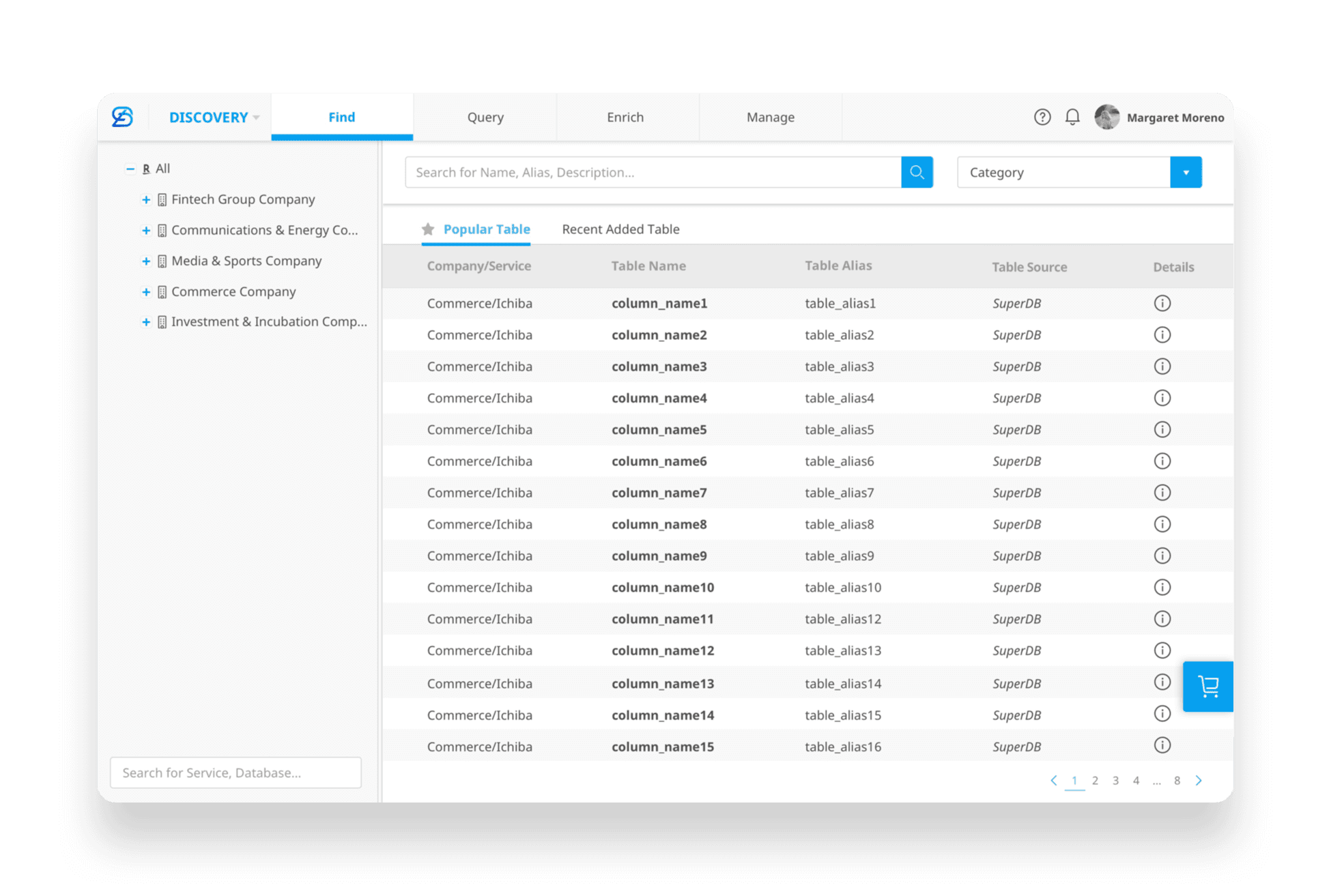
Improved Prototype
Reduced left-panel footprint to allocate more space for primary content
Surfaced tables and columns in the right panel to support searching, filtering, sorting, and comparison
Higher information density, showing more tables and columns within the same screen space

By surfacing key attributes such as GSD and sensitivity level, users can quickly evaluate and select the columns they need
By mimicking a shopping-cart experience, the interaction feels familiar and intuitive, reducing learning effort
[Handover for Data Discovery]
[Takeaways]
Regular communication with users allowed us to prioritize real workflow pain points over assumed best practices, resulting in a highly efficient tool tailored to daily use.
What initially appeared to be a complex data-management problem became solvable through continuous user feedback and rapid iteration.
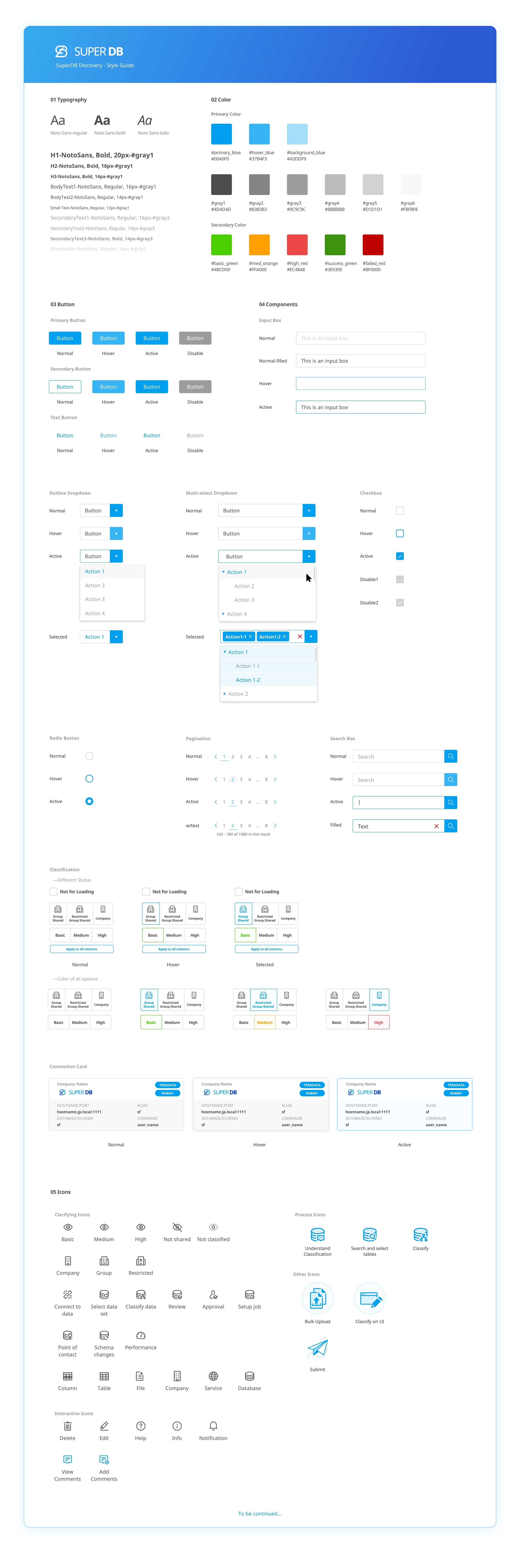
[04. Design System]
I established SuperDB’s visual language by balancing adherence to the company design system with targeted customization. While maintaining brand coherence, I created components and iconography to support SuperDB’s data-dense, enterprise-focused use cases—ensuring consistency, scalability, and clarity across the product.
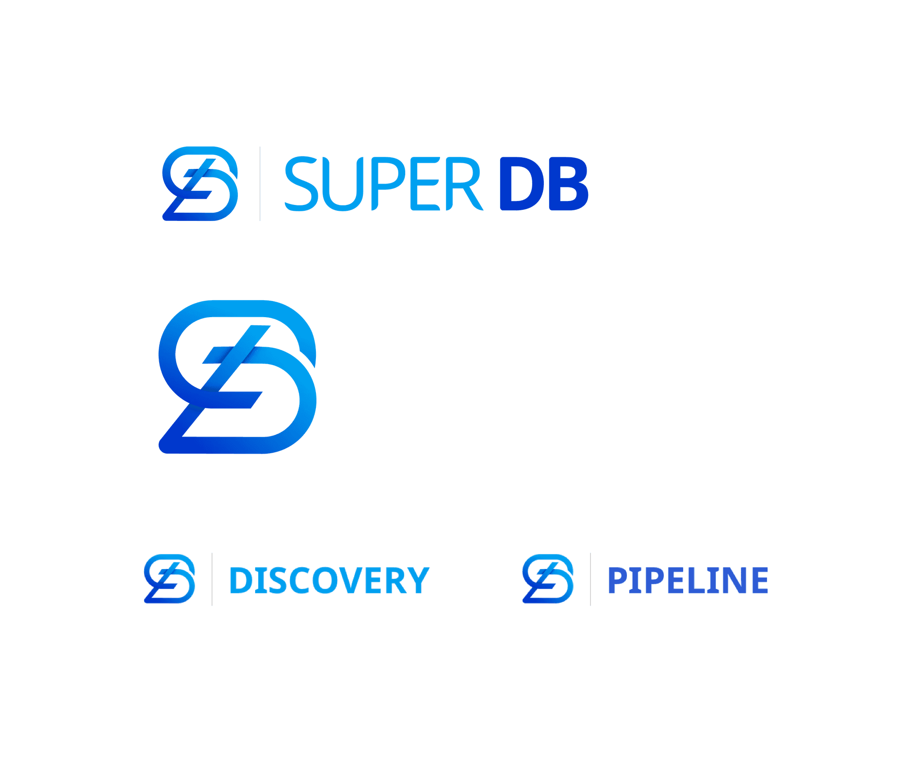
[05. Branding]
The logo explores a typographic concept that merges the letters “d” and “b” into a unified, recognizable form. After iterating on multiple directions, I shortlisted four options and validated them through a department-wide survey. Final logo was selected based on collective feedback.

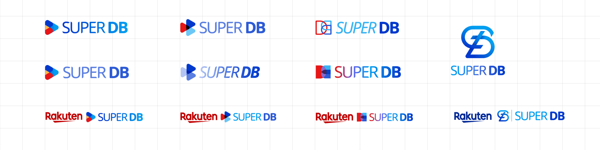
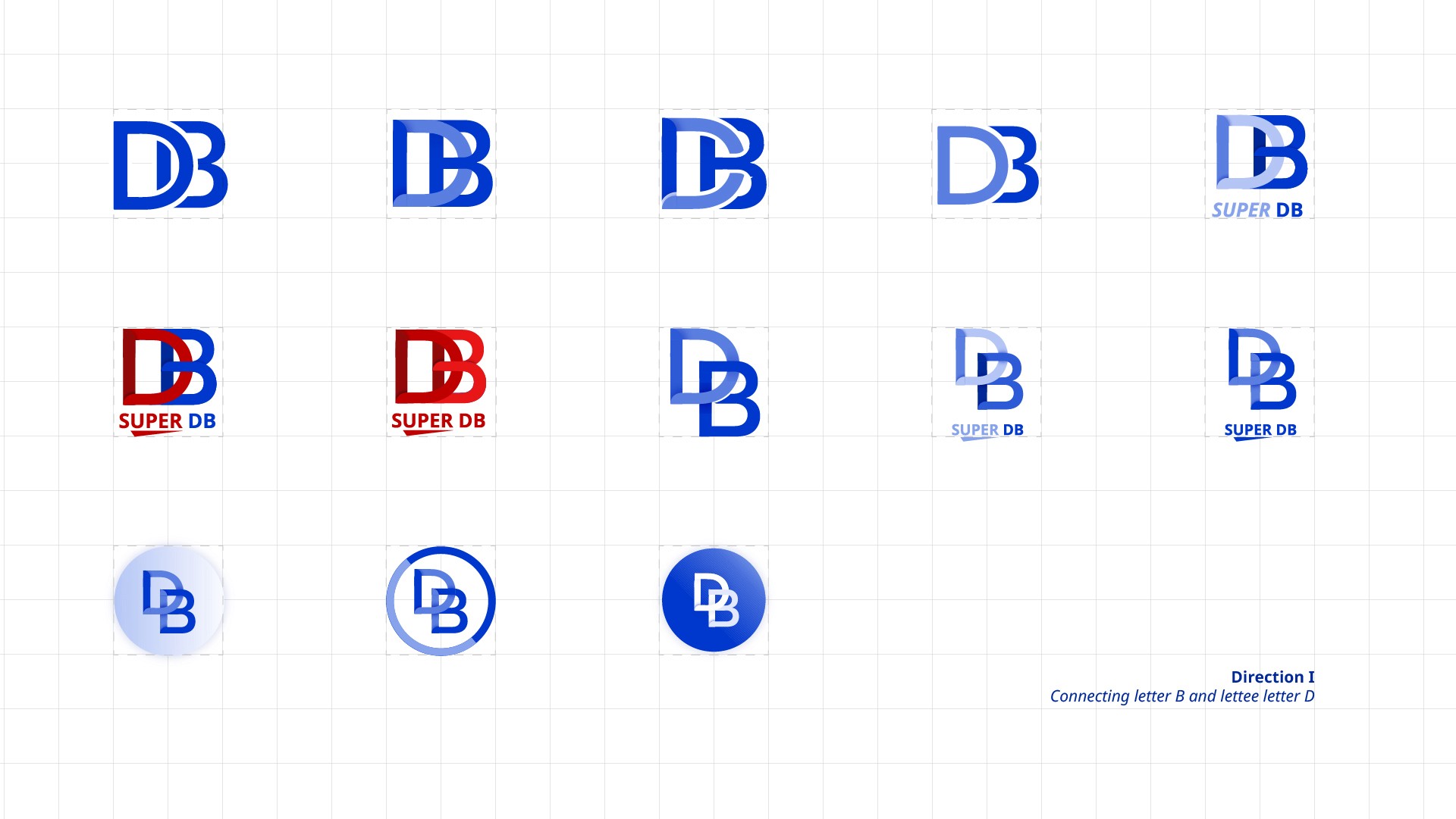
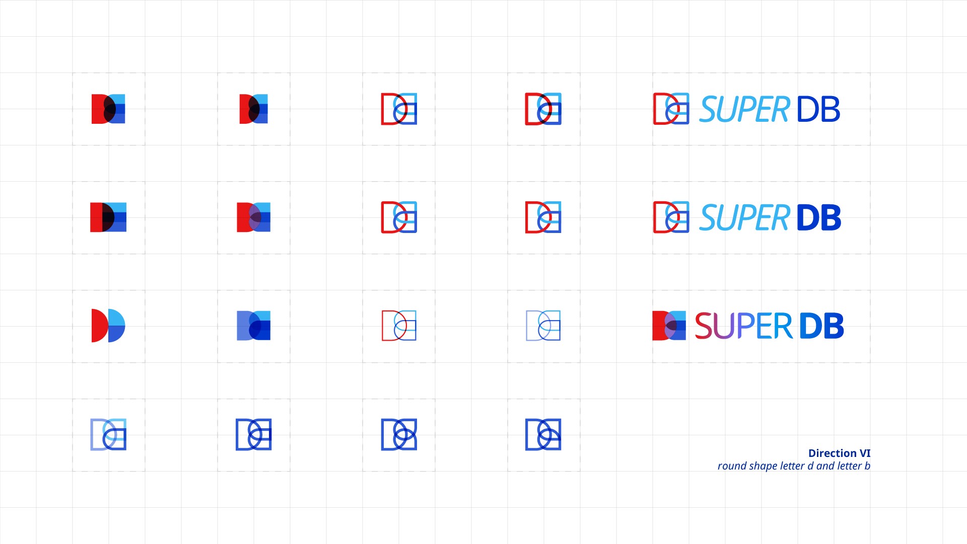
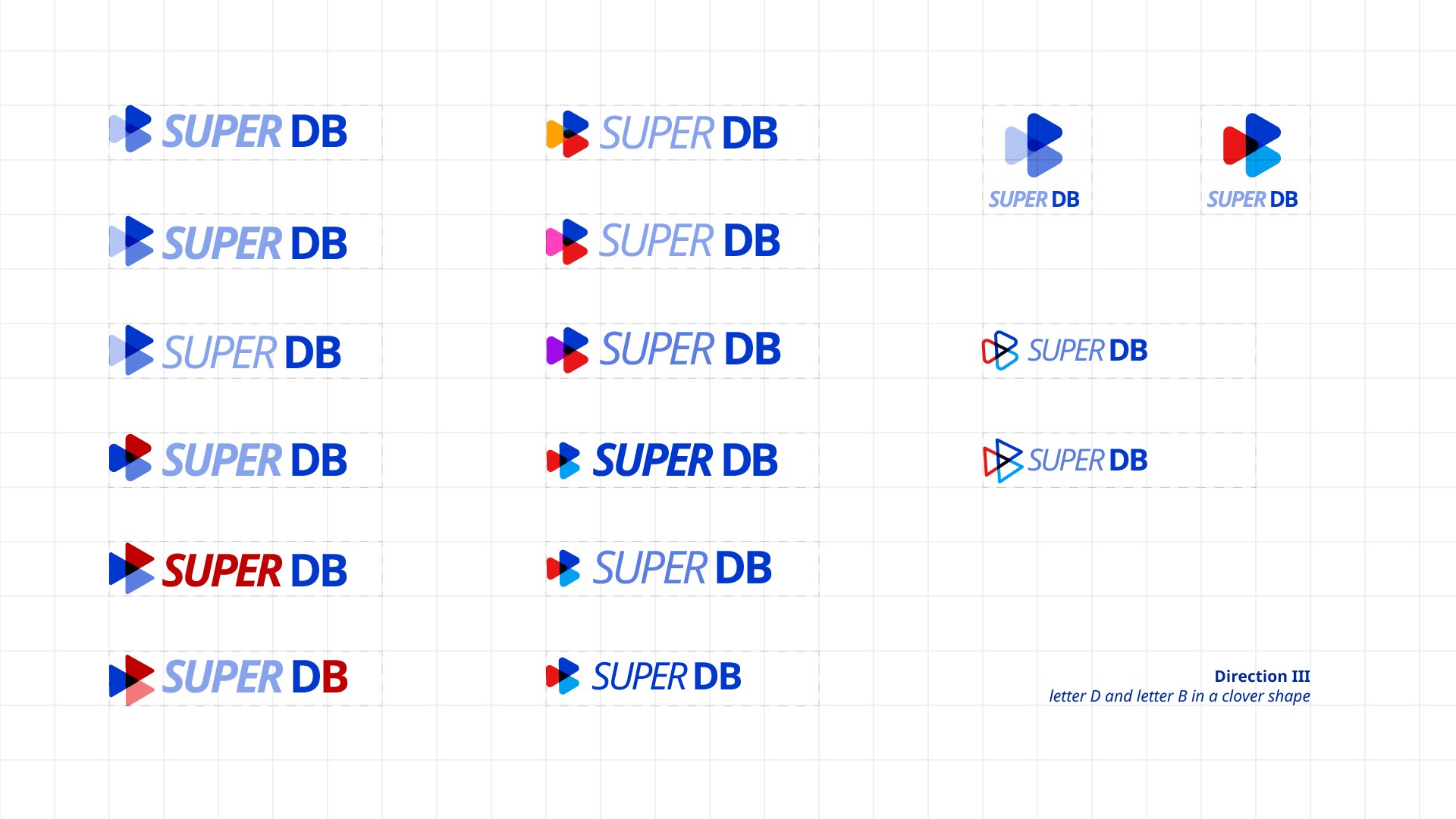
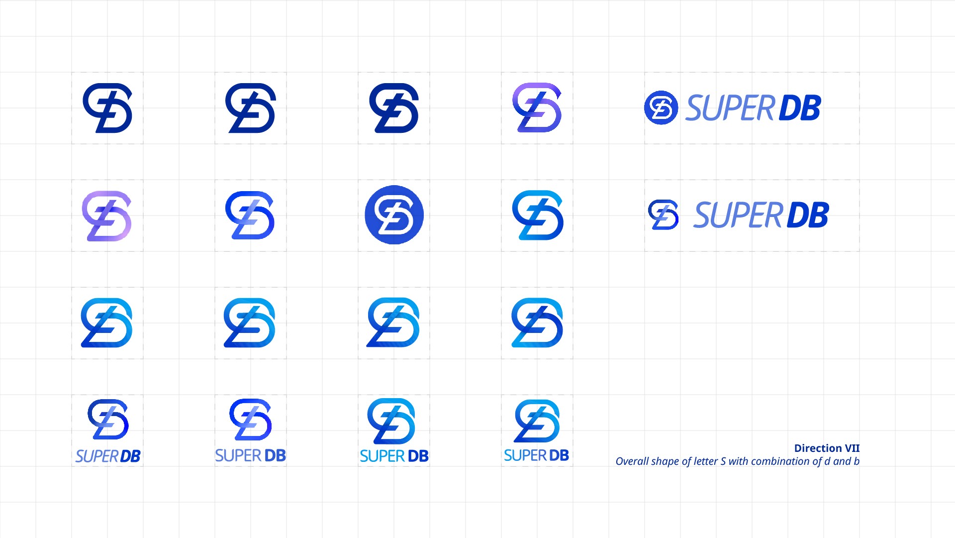
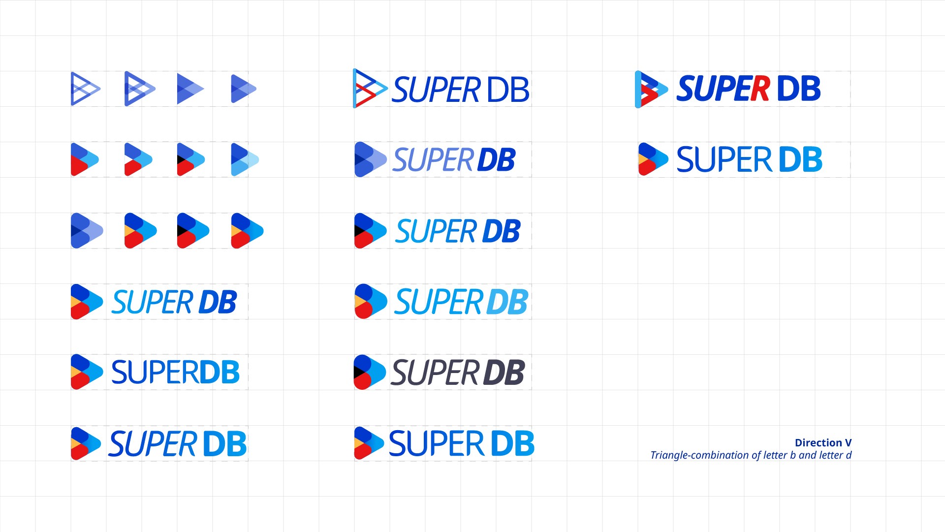
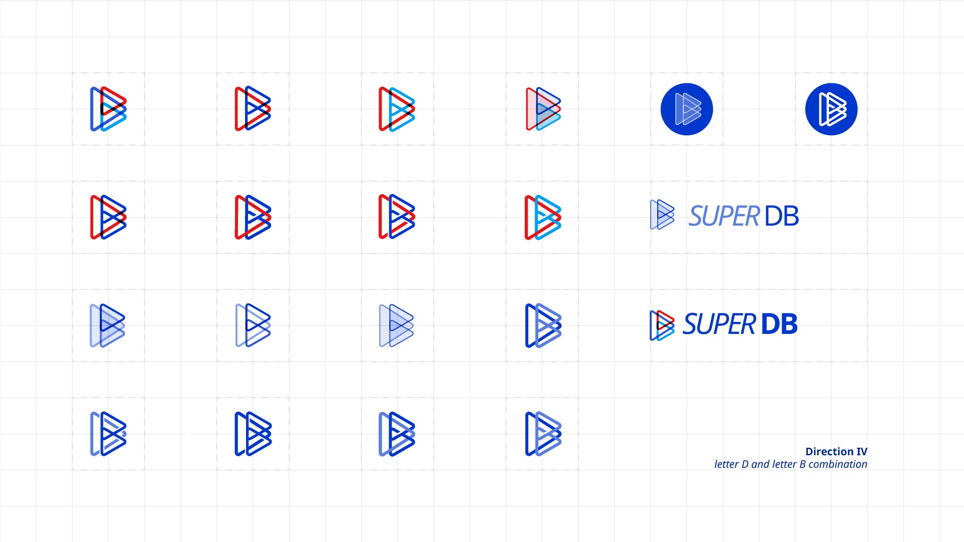
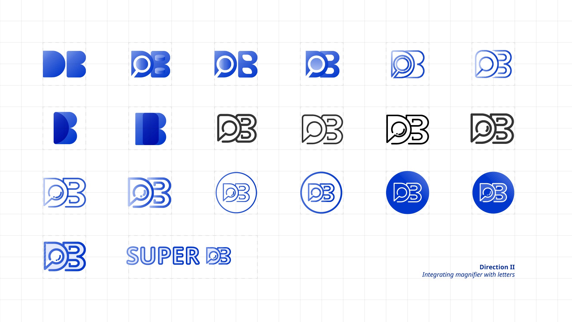
Design explorations on logo