[Case Study 02]
SakeWiz
Food & Drink
SakeWiz: Making Traditional Sake Accessible to Global Drinkers
Goals:
Restructuring Information Architecture, Simplifying Complex UX, Defining Visual Direction
My Impact
Transformed a complex, expert-centric database into an intuitive discovery platform by simplifying technical jargon and streamlining navigation. This redesign successfully removed "dead-end" experiences and created a scalable framework that makes sake culture accessible to users of all levels.
[Industry]
Food & Drink
[My Role]
Lead Designer
[Platforms]
iOS, Android
[Timeline]
2019
[01. Background]
SakeWiz is a startup founded by a group of enthusiasts dedicated to bringing Japanese sake culture to a global audience. While there are many apps for wine and beer, the team realized that sake was underrepresented in the digital space. After the initial launch, I had the opportunity to redesign the app to create a more seamless and intuitive user experience.
My first step was to interview stakeholders to align on the company’s vision. SakeWiz aims to build the world’s most comprehensive sake database using its advanced label-recognition technology. Based on these insights, we defined four key goals for the redesign
[Goals]
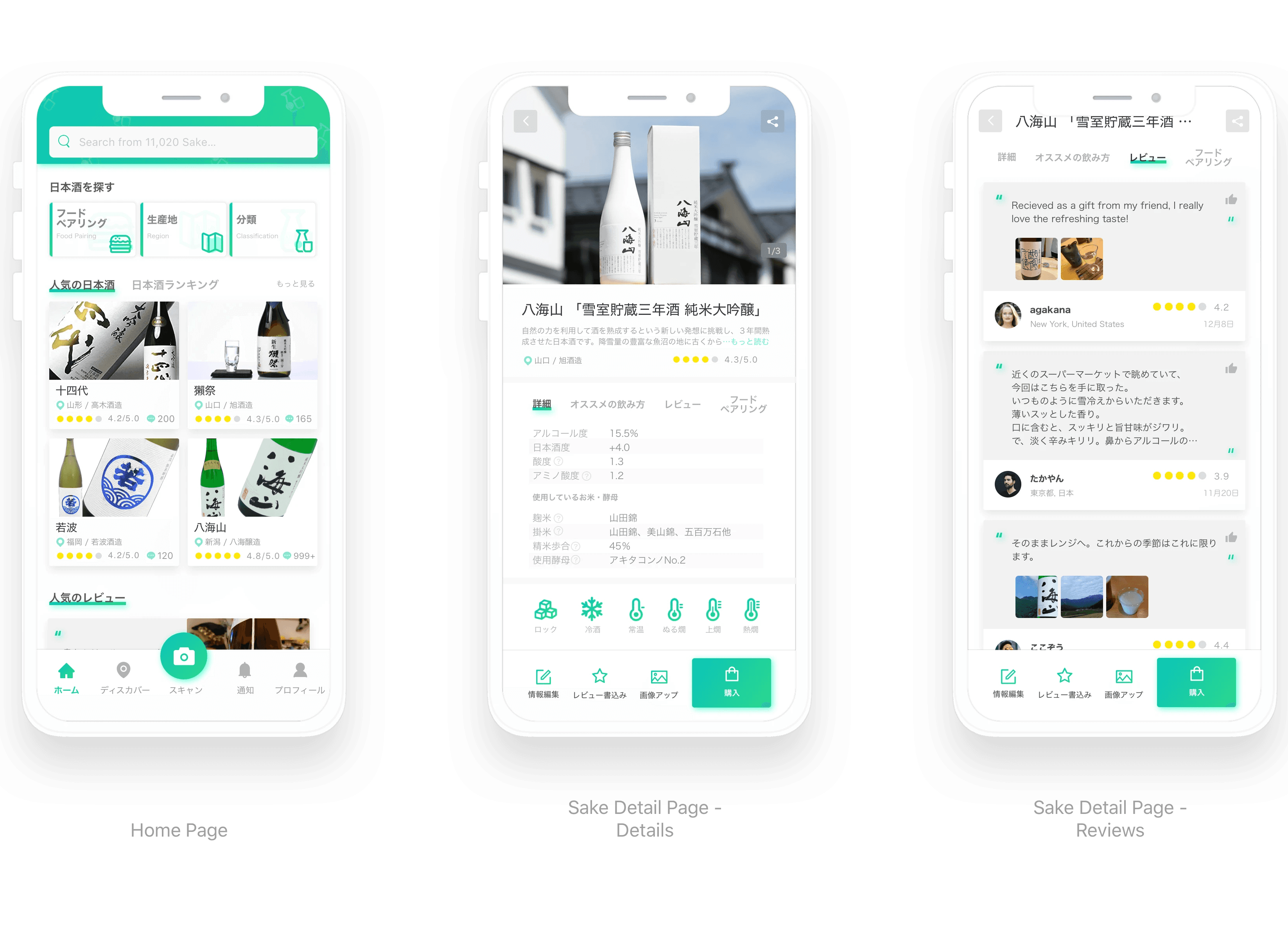
Know Your Sake
Instantly access detailed info—like region, brewery, and food pairings—simply by scanning the label.
Smart Discovery
Use the interactive map to find top-rated breweries and restaurants based on community reviews.
Community Engagement
Connect with fellow enthusiasts, share tasting notes, and follow experts for trusted advice.
All-in-One Experience
Manage your personal collection, track your ratings, and receive personalized recommendations.
[Learn from users]
While SakeWiz was originally inspired by sake enthusiasts, we wanted the app to be accessible to a broader range of users. To achieve this, I developed three distinct personas based on their level of sake knowledge.
These personas helped me identify specific needs—from basic service temperatures to complex regional classifications—and served as a strategic guide for the redesign.
Alex | The Novice

Context
Primarily enjoys sake socially with friends at bars and restaurants.
Pain Point
Lacks a specific preference for regions or classifications; often feels confused when choosing between warm or cold options.
Goal
Wants simple, reliable guidance to pick the right bottle and find the best food pairings for the cuisine.
Context
Enjoys sake both at home and dining out; has started developing preferences for certain regions and classifications
Pain Point
Wants to explore beyond her usual choices but finds it hard to discover new breweries through current tools.
Goal
Aims to expand her palate by searching for popular recommendations and learning from expert reviews.
Suzuki | The Expert
Context
A dedicated collector who understands the explicit distinctions in sake taste across different breweries and regions.
Pain Point
Needs a more efficient way to manage a large personal collection and record detailed tasting memos.
Goal
Desires a comprehensive digital journal to track his ratings and contribute professional opinions to the sake community.
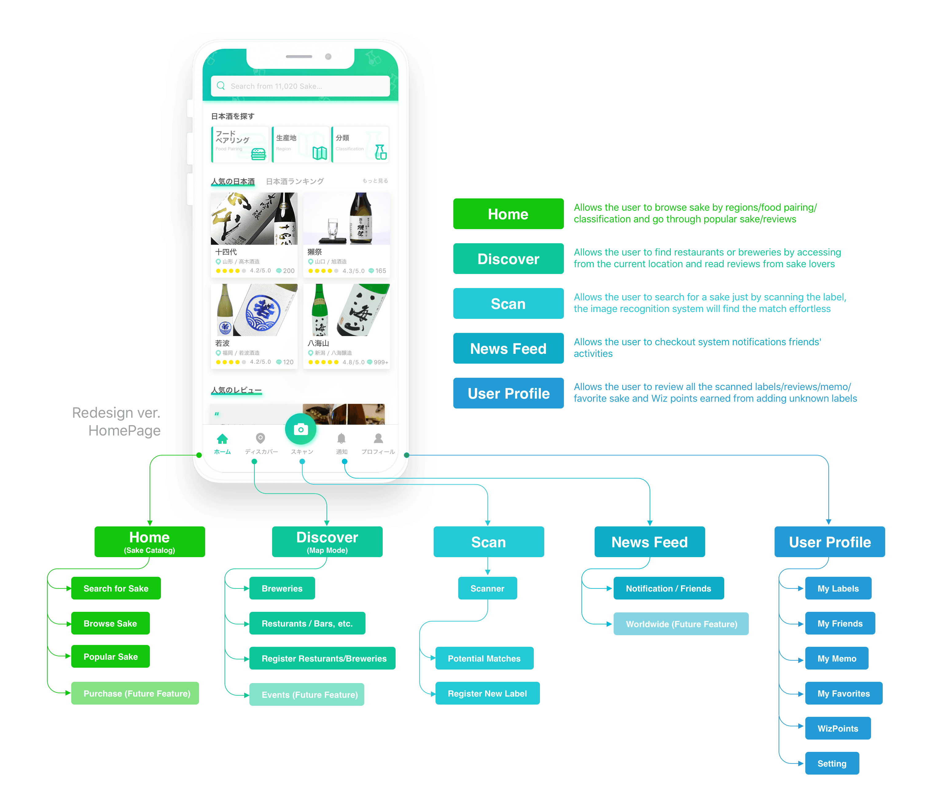
[02. UX Challenge - Untangling the Information Architecture]
The most critical issue I addressed was the fragmented information architecture.
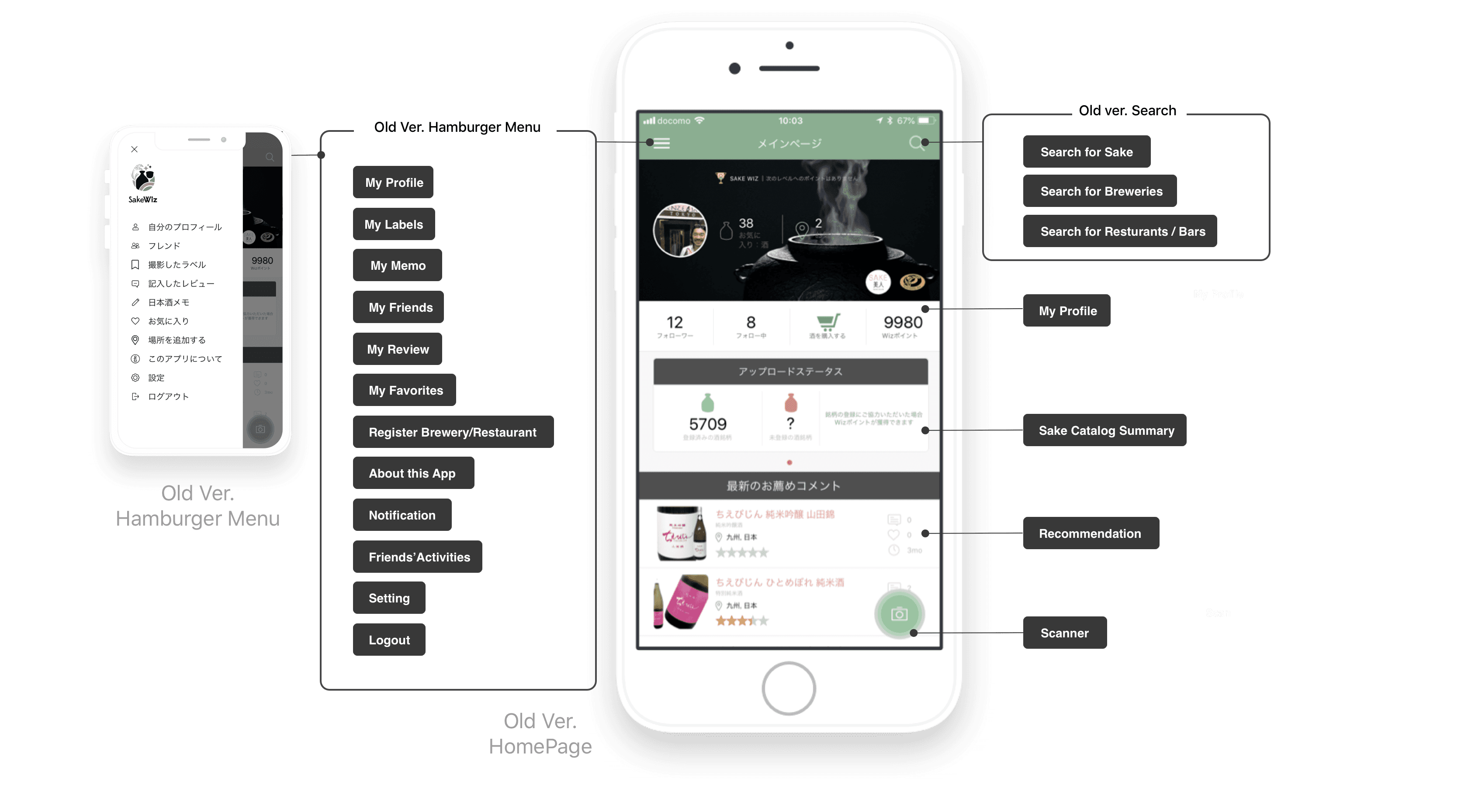
In the previous version, unorganized features and content created a steep learning curve, often leading to user frustration.
Furthermore, the existing structure hindered service growth. As new features were developed, they were simply "squeezed" into the homepage or hidden within a bloated hamburger menu. This resulted in redundant entry points—where the same function appeared in multiple, inconsistent locations—making the interface feel cluttered and unpredictable.
Affinity Mapping
To rebuild the foundation, I conducted an Affinity Mapping session with stakeholders. We started by auditing every existing function and content piece, representing them as post-its. By organizing these clusters based on our primary goals, we were able to eliminate redundancies and ideate new, essential features.
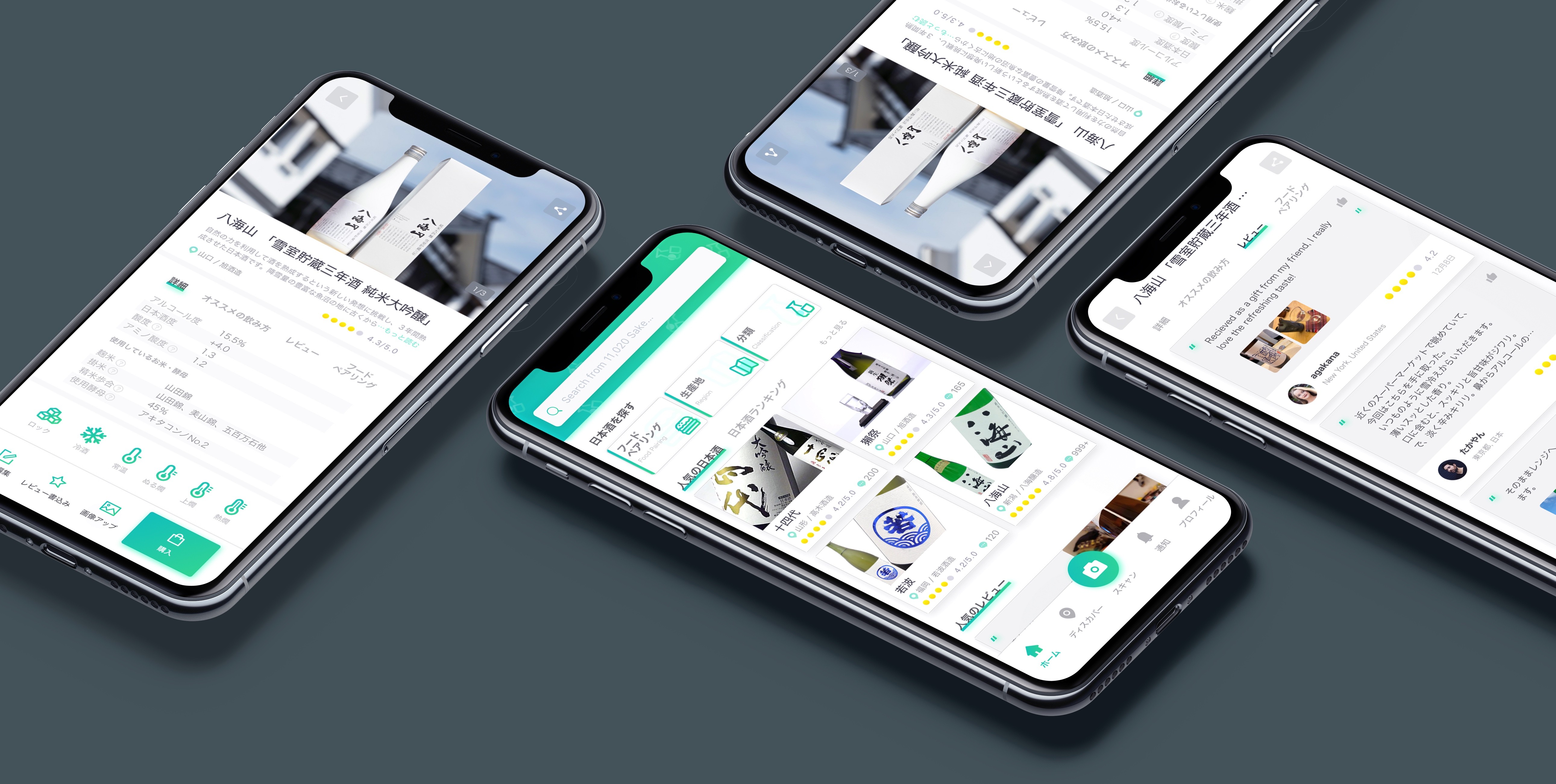
Ultimately, we established a more scalable structure by distributing functions across five core surfaces: Home, Scan, Map, Notifications, and My Page. This ensured that every tool had a logical home and room to grow.
[Ideation]
With a solid information architecture in place, I began developing low-fidelity wireframes to visualize the new user journey. The goal was to translate our high-level ideas into a functional interface, focusing on the five core surfaces we identified.
During this phase, I conducted iterative reviews with stakeholders. This collaborative process allowed us to test the logic of the new navigation and ensure that every key feature—from the scanner to the community feed—was both accessible and intuitive before moving into high-fidelity design.
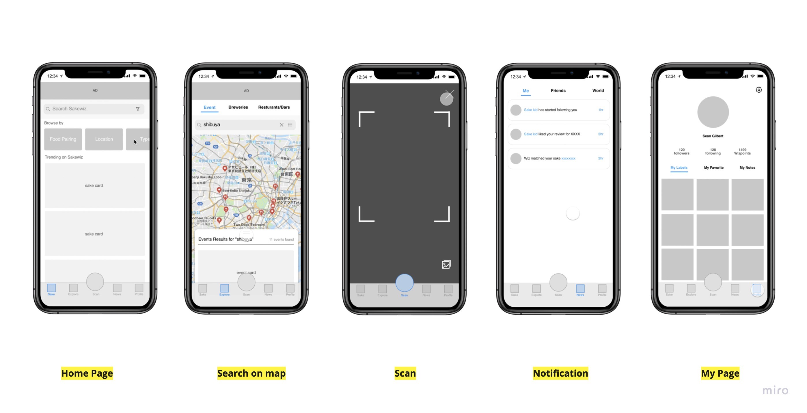
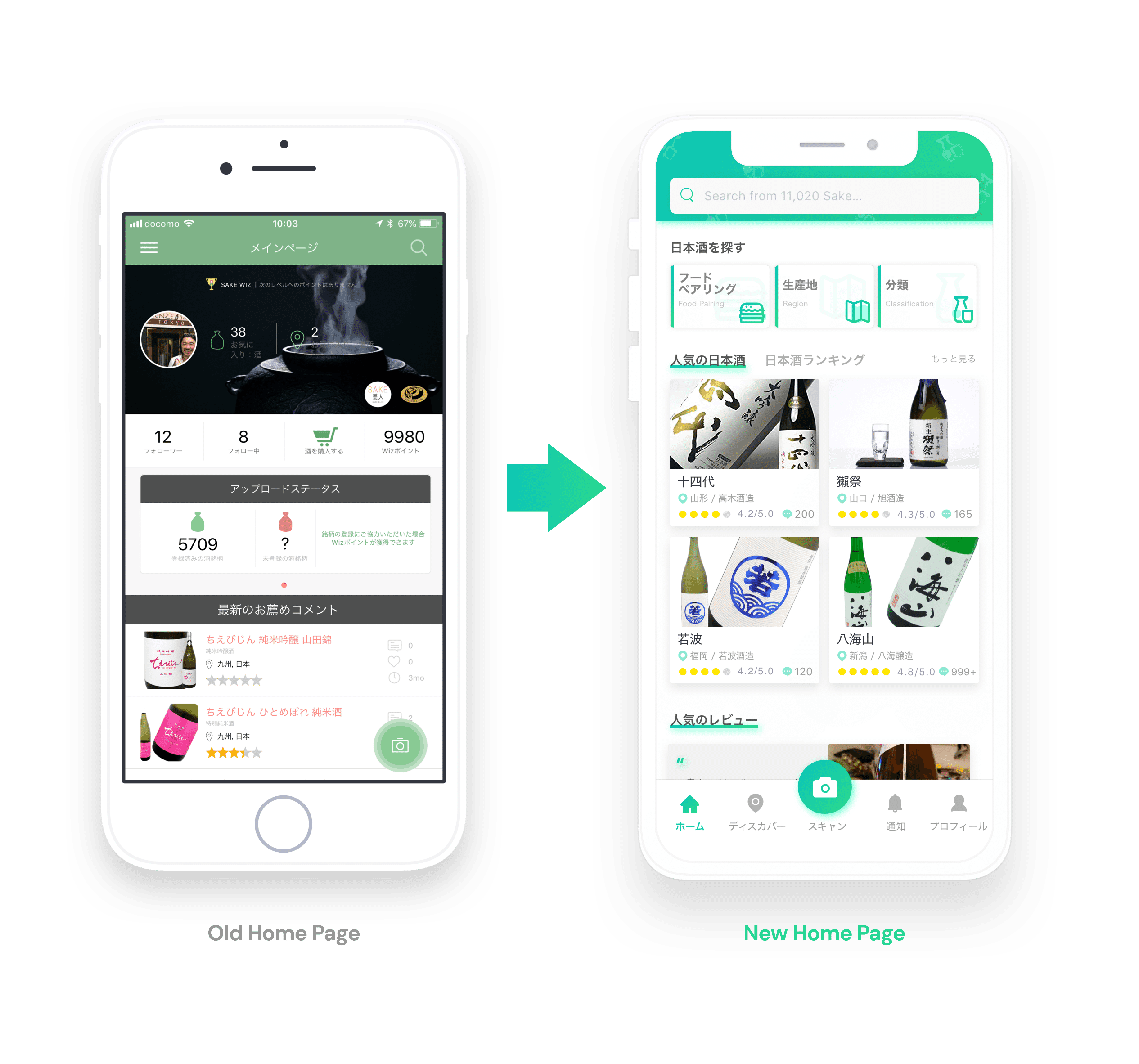
The redesigned architecture successfully streamlined the navigation, replacing the cluttered hamburger menu with a clean tab bar. This change not only simplified the user experience but also created a scalable framework that can easily accommodate future features as the app continues to grow.
[03. UX Challenge - Improving the Browsing & Searching Experience]
Originally, SakeWiz was tailored for sake enthusiasts who already possessed the vocabulary to find exactly what they wanted. However, to welcome novices and casual drinkers, I had to bridge the "knowledge gap." These users often face selection anxiety because they don't yet know the specific names or categories to search for.
To address this, I mapped out the user journey for all three personas, creating a detailed flow chart of the browse and search experience. This allowed me to pinpoint exactly where friction occurred and identify five key pain points that were preventing a smooth discovery process.
"Analyzing the Friction" By visualizing the interaction flow, I identified that the search process was too linear and rigid, assuming the user already knew what they were looking for. I needed to introduce a more exploratory path for those who were still learning.
Solving Pain Point #1:
Limited Browsing & Discoverability
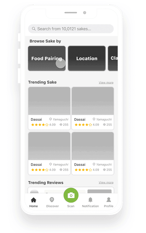
[Before: A Restrictive Entry Point]
Static Exploration
The browsing experience was limited to either a generic catalog or a few basic recommendations, offering no entry point for users without a specific goal.
Hidden Interactions
Key features were unintuitive. For example, the total count of sake was a clickable button leading to the search page, but its design lacked affordance, meaning most users never realized it was interactive.
[After: Guided Discovery for All]
Guided Exploration
Added categories like "Popular" and "Recent Reviews" to provide immediate inspiration for novices.
Logical Placement
Moved the catalog summary to the Search page to align with user expectations and reduce homepage clutter.
Intuitive Entry
Created clear browsing paths so casual drinkers can find the right sake even without knowing specific names.
Solving Pain Point #2:
Overwhelming Filters & Jargon
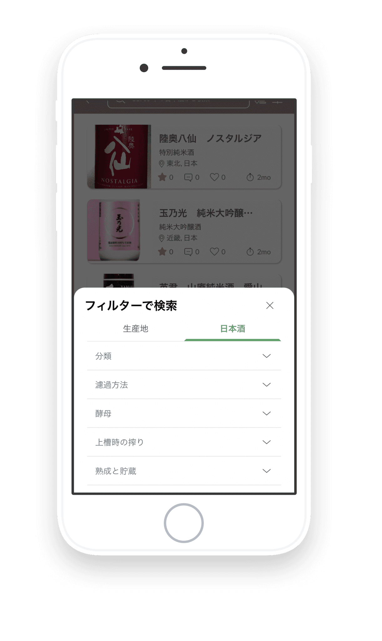

[Before: High Barrier to Entry]
Technical Jargon
Users were forced to navigate expert-level terms (like Polishing Ratio) without any guidance, causing confusion.
Complex Navigation
Filters were hidden or required "endless scrolling," making it difficult to narrow down choices quickly.
[After: Educational & Efficient Filtering]
Integrated Glossary
Added contextual "Explanation Cards" within the search flow to help users learn sake terminology while they browse.
Optimized Visibility
Redesigned the filter UI to ensure all primary options are visible at a glance, significantly reducing the time to find the perfect bottle.
Solving Pain Point #3:
The "Dead-End" Experience
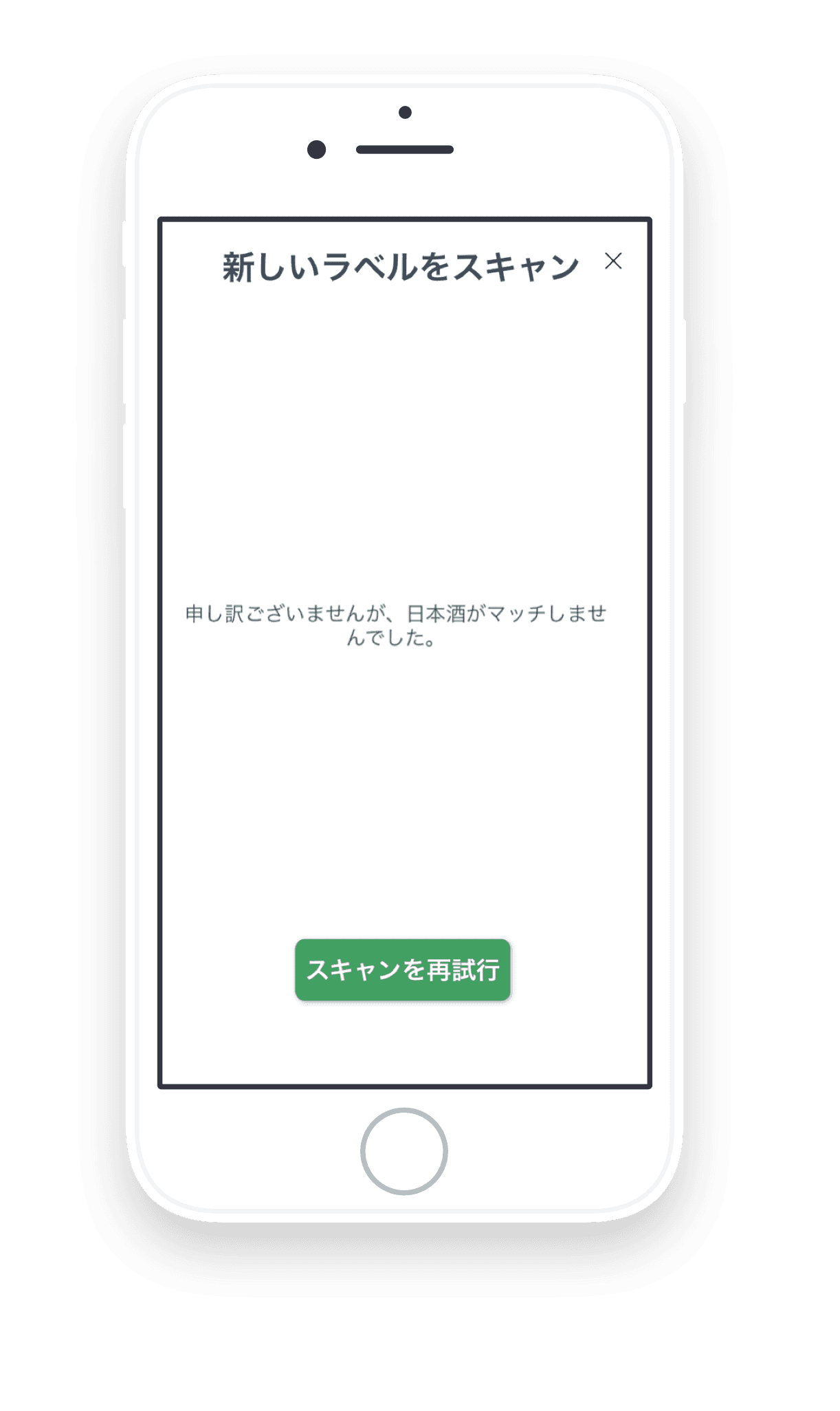
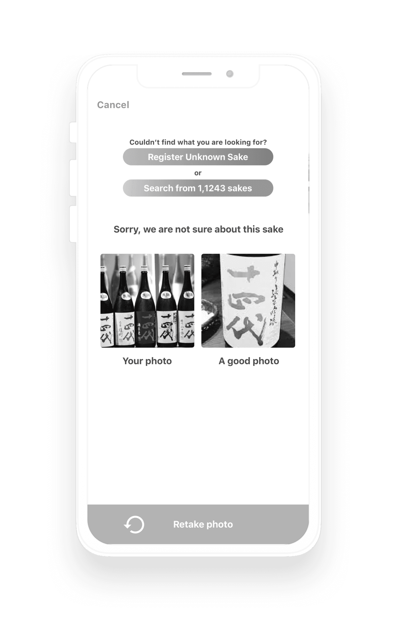
[Before: Frustrating Scan Failures]
Lack of Support
If the label-scanning failed, the app provided no next steps, leaving users stuck with no way to proceed.
[After: A Seamless Recovery Flow]
Multi-Option Recovery
Introduced three distinct paths to help users stay in the flow: Photo guidance (how to take a better shot), Manual registration, or Text-based search.
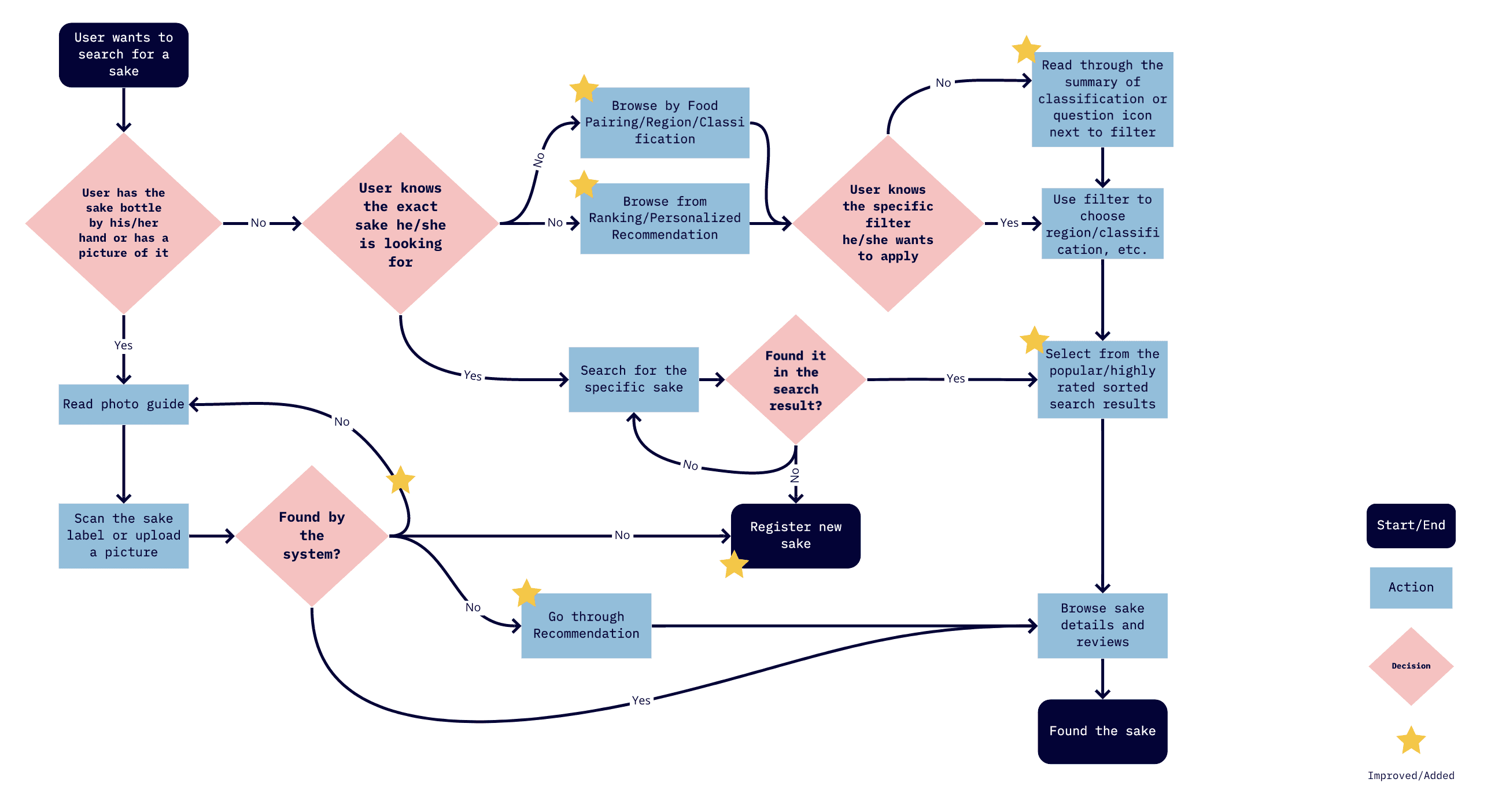
The flow chart after tackling 3 painpoints
[04. Handover & Visual Design]
[05. Reflection]
Redesigning SakeWiz taught me how to translate a deep, traditional culture into a modern digital experience. By applying the Feynman Technique to my design process—breaking down complex brewing terms until they were simple enough for anyone to understand—I was able to create an app that doesn't just scan labels, but actually teaches users about the craft of sake. My goal was to turn a tool into a companion for every user's sake journey.