top of page

zoey xie

Rakuten Big Data Web Application
SuperDB
SuperDB is a big data web application that provides business analysts and data scientists the capabilities to easily ingest, transform and consume data assets, while aligning to the regulations and Information Security guidelines.
Project Type /
UI/UX Design
Group Work
Year /
2018~2019
My Responsibilities
Interaction Design
Wireframing
Prototyping
Usability Test
Visual Design
Platforms
Web
Design Process

Website Structure
structure
SuperDB platform consists of two products: Discovery and Pipeline. The current focus is the Discovery product. I worked with the product owner and manager to create the website structure based on user requirements.
Insights

Web Structure
UX Challenges
ux
Challenge#1- Classify Data Sets
What's the user's GOAL?
Update and enrich metadata for data sets and classify data sets to meet regulations.
What's the flow?
In the existing process, the most frustrating part is classifying countless table columns in an Excel sheet. The web application is designed to solve this problem by:
-
To allow the user to classify with an intuitive UI
-
To allow the user to bulk upload the Excel sheets, review, submit online
In this case, designing an intuitive UI becomes the challenge.

Classification-Flow Chart
Painpoints
Opportunities
-
Reduce the efforts of clicking and scrolling
-
Allow the user to classify data efficiently and without error
-
Allow the approver to give feedback on changes
-
Easy to preview columns data before classify attributes
#1 Wireframe
1wireframe

UI Classification Flow
Through the brainstorming and paper mockups, we divided this task into three steps:
-
Enter table details (allow the user to input metadata)
-
Classify attributes (allow the user to classify all the columns from all the tables)
-
Review (allow the user to review the classification and submit)
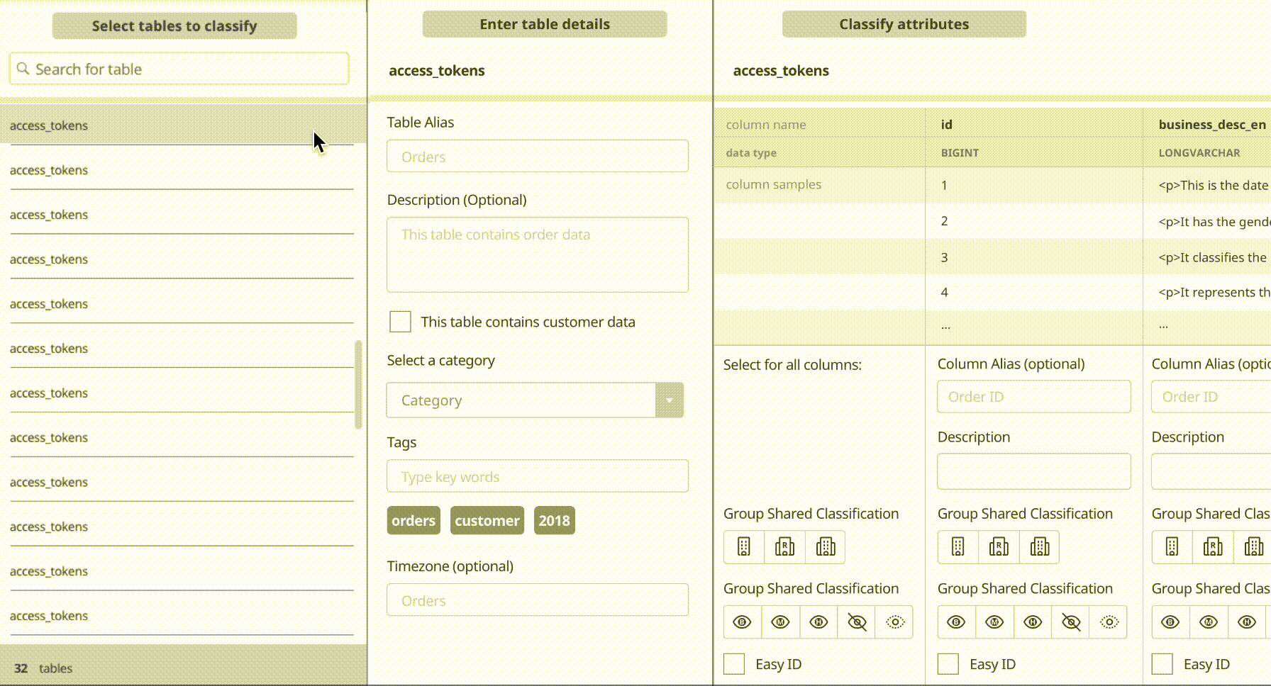
#1 wireframe for classify attributes
What worked?
-
Clear logic similar to Excel sheet: require less learning curve: allow the user to switch to another table by one click
What didn't work?
-
Really long page with horizontal scrolling
-
Easy to lose count among the columns
-
Limited space to preview sample data
#2 Wireframe
2wireframe
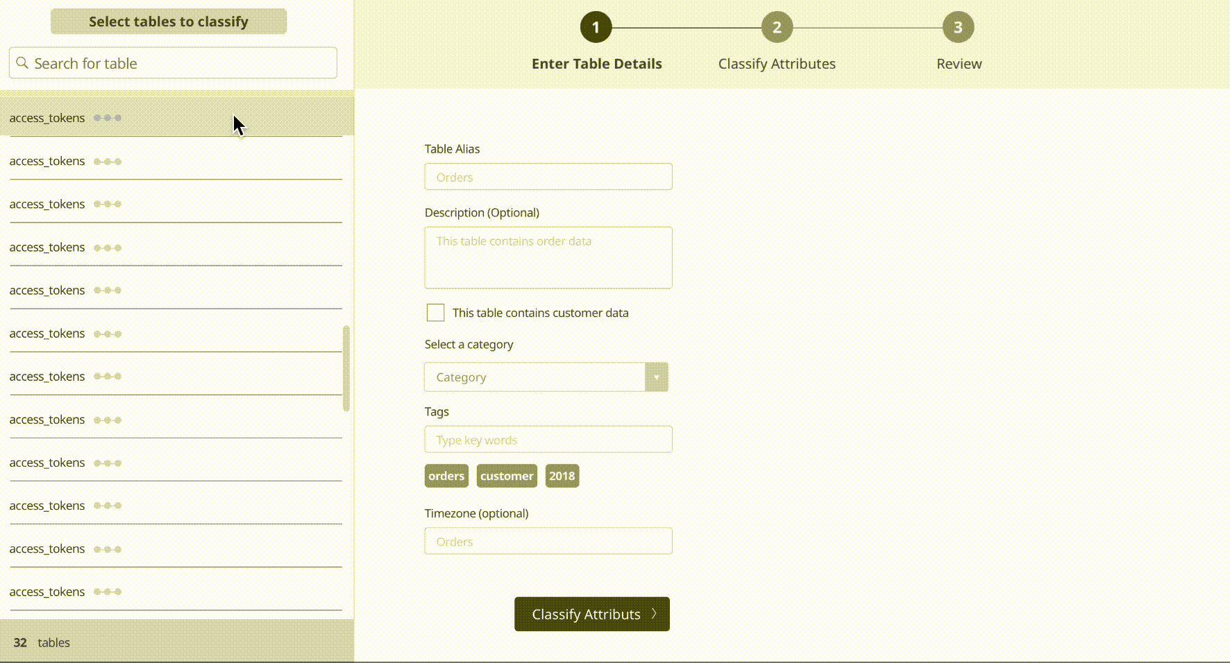
#2 wireframe for classify attributes
What worked?
-
Clear process by introducing three-step wizard
-
Less horizontal scrolling compare to the previous version
-
Icon + text works better for decision-making
What didn't work?
-
Horizontal scrolling (less but still)
-
Has to scroll vertically to preview the sample data
#1 Hi-fidelity Mockup
1mockup
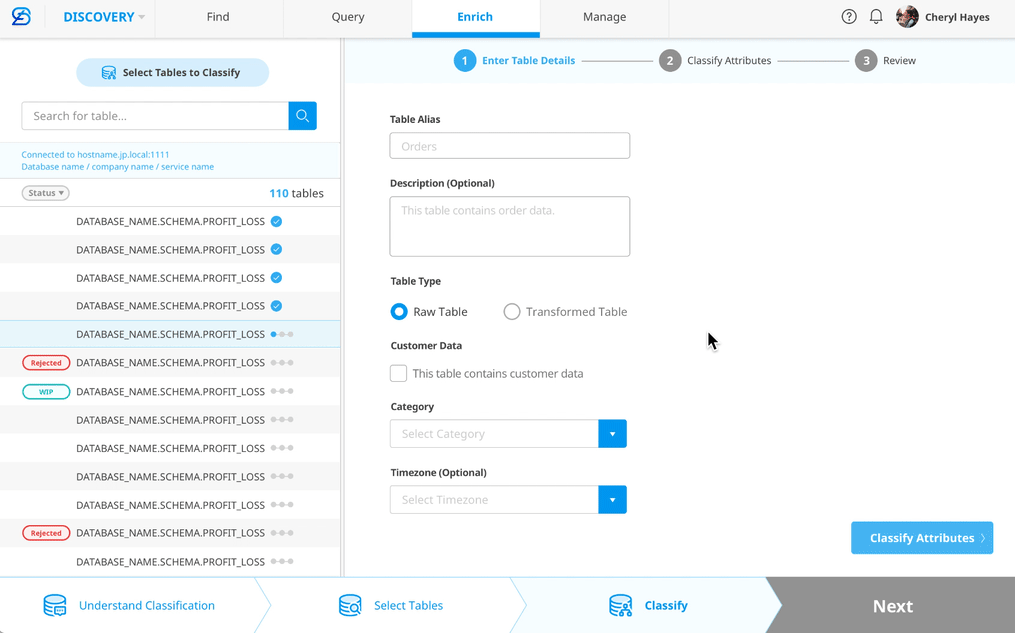
#1 Hi-fidelity mockup-classify attributes
Detail animation
What worked?
-
Three dots sit next to each table name reflects the current process
-
A carousel-like component allows the user to switch to next column earlier
-
Added an "Apply to all" button that allows the user to copy the first column's input to other columns
What didn't work?
-
More clicks (switch to next column)
#2 Hi-fidelity Mockup
2mockup

#2 Hi-fidelity mockup-classify attributes
From Horizontal to Vertical
After receiving feedback from our core users, we changed the design from horizontal layout to vertical layout. Originally, we wanted to keep the scrolling style similar to Excel so users wouldn't need to have a steep learning curve. However, user preferred to do vertical scrolling considering the daily workload. So we changed it to vertical layout and gained positive feedbacks.
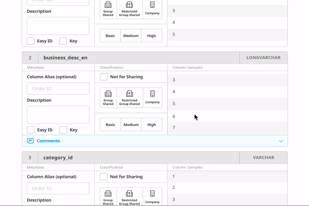
Interaction details
Final Design for Classify Attributes
finaldesign


Classification-Enter details

Classification-Classify attributes2

Classification-Review
Classification-Enter details
1/4
challenge2
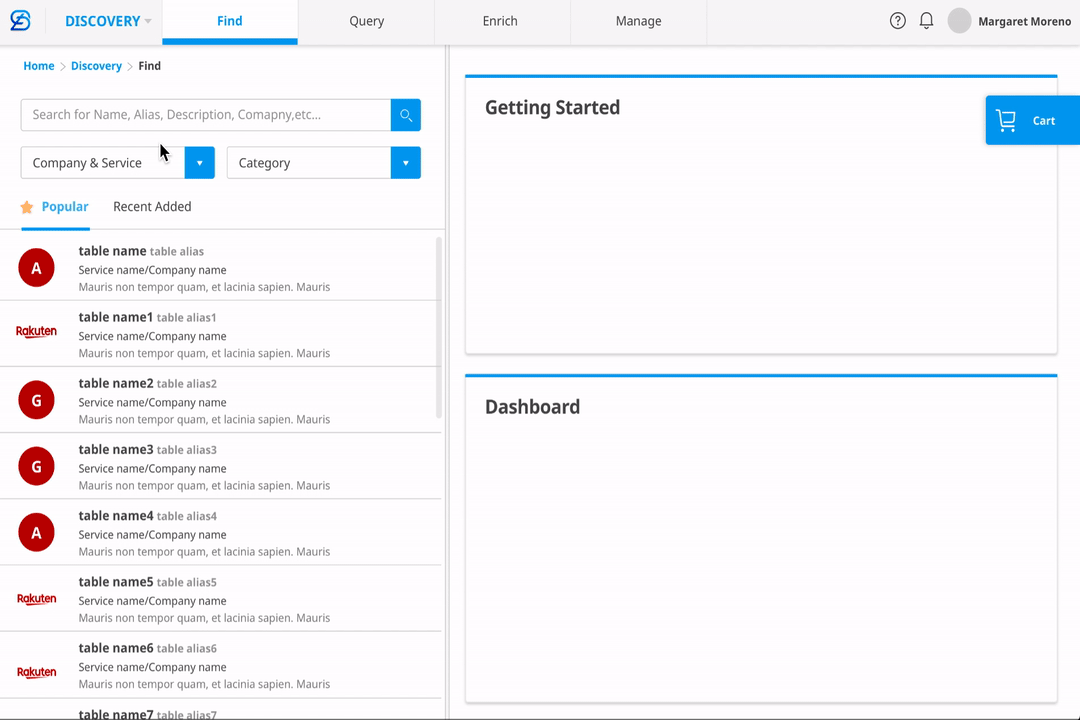
Challenge#2- Search for Data
What's the user's GOAL?
-
Search for data assets with keywords
-
Browse data assets within different company/service/database, etc.
-
Get metadata, security-related information for tables/columns
-
Request access to data
What's the flow?
-
Based on the users' goal, I came up with an idea that allows the user to have an ecommerce-like experience where they can put the data assets to "Data Cart". The process of requiring access becomes a similar process to "checking out" on an EC site. This pattern will reduce the user's learning effort and turn an unfamiliar to experience into a familiar experience.

Search for Data-Flow Chart
Painpoints
-
7 levels of hierarchies makes it difficult to navigate/browse data assets
-
Difficult to browse table details/column details to make decision on which columns to apply access
Opportunities
-
Allow the user to easily navigate through 7 levels of hierarchies to browse/search for data assets
-
Allow the user to browse table details/column details
mockup1-search for data
#1 Mockup-Search for Data
#1 mockup for search for data
What worked?
-
Clear logic of showing details for each table/column
-
Easy to switch between table search and column search with tabs
What didn't work?
-
Too many levels in the company & service filter dropdown make it hard to navigate
#1 mockup for require access
What worked?
-
Clear logic of showing details for each table/column
-
Column format is consistent to classification function
What didn't work?
-
Each column takes too much space, makes it more scrolling and less effective information on a page
#2 Mockup-Search for Data
mockup2-search for data

#2 mockup for search for data
What worked?
-
Easy to navigate and filter through 7 layers of databases
-
Easy to switch between table search and column search
-
More effective information on the page (more tables/columns are shown within the same space)
What didn't work?
-
The two search boxes on the top seems to confuse the user

#2 mockup for require access
What worked?
-
More effective information on the page (more tables/columns are shown within the same space)
What didn't work?
-
Hidden secondary column details require one extra click to review
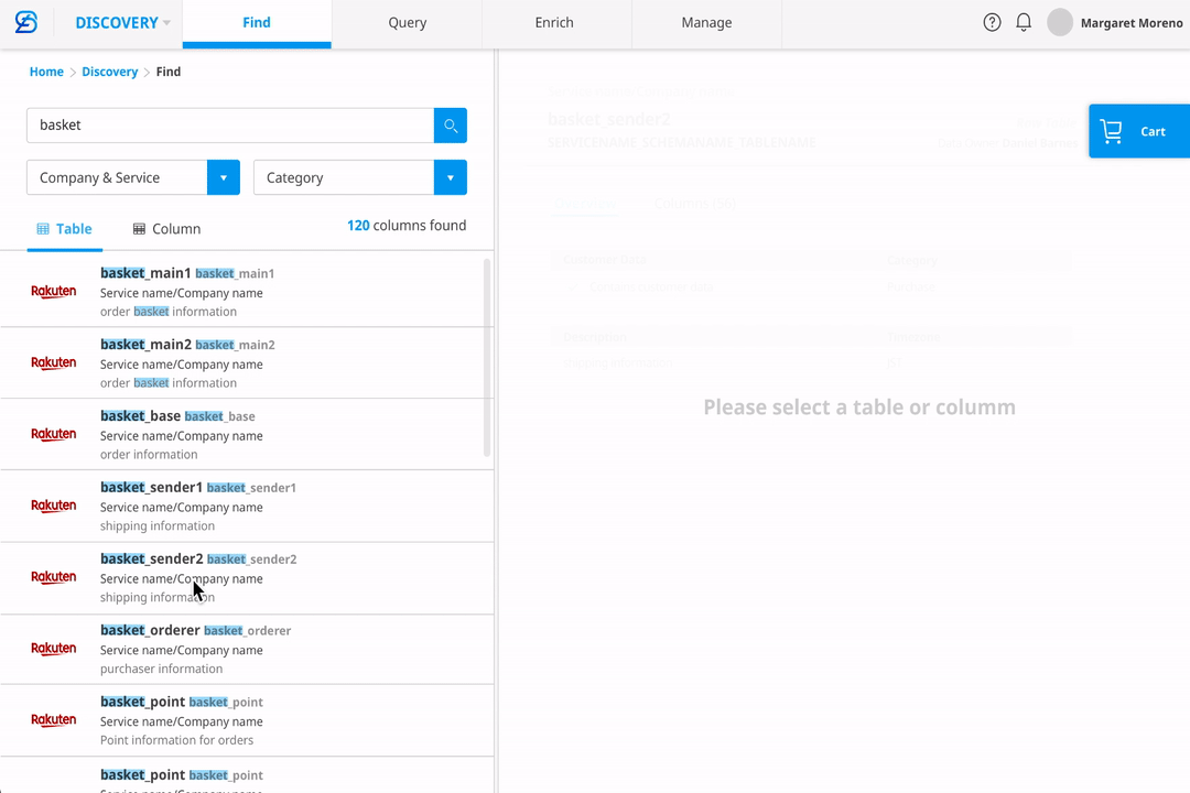
final design-find
Final Design for Discovery Find-Search for Data

Find-Search-main page

Find-Search-results

Find-Column details
Find-Search-main page
1/4
Visual Design
visualdesign
Style Guide
For the visual design, I tried to compromise corporation design language for brand coherence. However, SuperDB is very different from most of the products developed in the company, I customized many components and icons following the same principle to be visually consistent.

Branding
branding
To design the logo, I tried to combine the letter "d" with the letter "b" to form a meaningful shape. In the following picture were the four final options that I sent out for a survey in the department. After voting, option4 won.

Four final options of Logo design

Logo Mark

Final Design

super db logo-6

super db logo-7

super db logo-4
super db logo-6
1/7
Logo Design Process

Thank you!


bottom of page